Images are used for various reasons online such as:
- to help tell the story e.g. a photograph
- provide information e.g. an infographic
- to act as a visual clue (signpost) to the content e.g. an icon
- to make a page more visually appealing
To meet accessibility standards, information given by non-text content must also be provided as text. This means it can be changed or interpreted into other forms such as large print, Braille, speech, symbols or simpler language. This text alternative must provide an equivalent purpose.
There are a couple of options for text alternatives:
- ‘Alt’ text value – is read out by screen readers or displayed if the browser cannot display the image.
- Text surrounding the image
Alternative (alt) text
For simpler images such as a photograph or graphic, you can provide a text alternative using ‘alt’ text. Most content management systems such as t4 or WordPress provide an alt-text field when adding an image. In the case of t4, this is mandatory.
When writing alt text, consider:
- What is the image saying? What is its function or purpose on the page?
- Does the image have any embedded text? Such as a slogan or a logo
- Does the surrounding content provide context? Is the subject of the image described?
How to decide if to add alt text or not
The decision on whether to add alt text or not can be difficult and should be decided on a case-by-case basis. To help with this decision, the Web Accessibility Initiative (WAI) have produced this alt decision tree, which goes through a serious of questions, and based on the answers, it recommends a course or action.
Alternative text examples
A decorative photograph
A decorative image is usually an image used to make a web page more visually appealing. For example a banner image like this:

'Decorative' images could include:
- Visual styling, for example horizontal lines or borders
- Images that are supplementary to link text to improve its appearance. For example an arrow or icon
- Illustrative of adjacent text but not contributing any information (“eye-candy”);
- Images that are identified and described by surrounding text.
If the content management system you are using allows it for example Terminal four, then you should always leave the alt text field as blank for decorative images as they are not providing core information to users. Doing this will mean that screen readers will ignore them, allowing users to navigate your content faster.
If the alt text field is mandatory, then you should provide a simple text version describing what the image is showing.
Find out more about decorative images (Web Accessibility Initiative)
An image to support text content
In this example an image is being used in a news article.

Professor Carol Propper, from Imperial College Business School, has been made an International Fellow of the National Academy of Medicine.
Professor Propper, Associate Dean of Faculty and Research at the Business School, was named among 85 new members, including 10 international members, to be elected to the National Academy of Medicine (NAM), a prestigious US based body which “recognizes individuals who have demonstrated outstanding professional achievement and commitment to service.”
The supporting text explains who Professor Propper is and why she is featured, so the image does not provide additional information, so the alt text could again be left blank.
Graphics or photographs with text elements
Accessibility regulations (WCAG 2.2) state that you should avoid images of text unless they are:
- Essential - examples could include a logo or a photograph of a sign
- Customisable by users i.e. the font, size and colour can be changed.
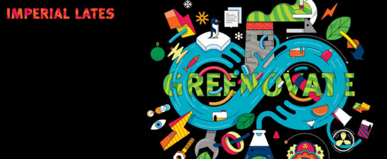
If you are using images of text like the one below, you must make sure you have a text alternative including all that text as well as conveying the message of the image. For example:

Imperial Lates presents, Greenovate. Explore a vision for a more sustainable future with a showcase of the green tech of tomorrow at our first Imperial Lates of the year
Charts and infographics
Sometimes you will want to include a more complex image such as a chart or an infographic displaying a lot of information. If you do not provide a text alternative for this content then users of screen readers will completely miss this.
It is not always possible (or recommended) to include all this information in the alt text field. So in these cases, you should include a summary paragraph or caption under the image which explains all the information or the message.
Example
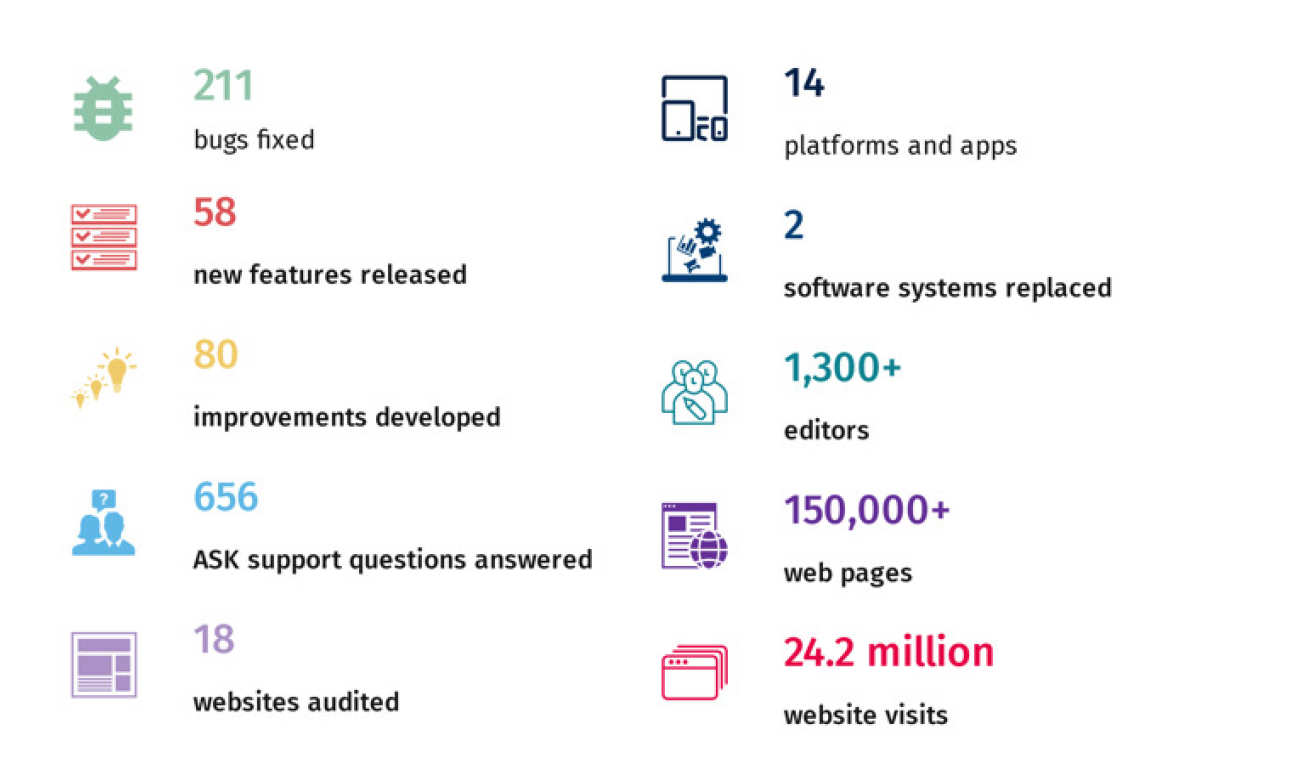
The infographic below has 10 pieces of information which will all need to be included as a text alternative.

To do this you can add basic alt text to the image and a full text description under the image:
Alt text
Infographic showing key statistics about the Imperial College London website. Full text description below.
Text description
Infographic showing 211 bugs fixed, 58 new features released, 80 improvements developed, 656 ASK support questions answered, 18 websites audited, 14 platform and apps, 2 software systems replaced, 1,300+ editors, 150,000+ web pages, 24.2 million website visits.
If the text description is very long you can add this to a separate page. You would then need to add a simple link to this page labelled Full text description below the image.
Do I need to explain everything on a chart?
There will be occasions where a chart is showing hundreds of pieces of data. In these cases, if you are not expecting users to analyse each of these, then it is not necessary to explain them all in text form. You should just concentrate on providing a summary of the key points.
The most important thing to consider is that users of screen readers or text-only browsers are not disadvantaged and will still get the message that the chart is conveying.
Further reading
- Alt Text: Not Always Needed (Neilson Norman Group)
- These, and other good examples of text alternatives are included on the accessible web page example.
- Read the W3C's guidance on images of text
- WebAIM article on alternative text