Headings give your document a structure and help people navigate it and understand the content hierarchy. This helps all people but is especially important to those using screen readers; they rely on these to understand the hierarchy of the information.
The heading styles in Word are not for decorative effect, they actually apply the structure to the page.
There’s more guidance on Using clear and effective headings.
How to apply heading styles to text
You can apply heading styles to your text by highlighting it and selecting a heading style from the list on the Home tab of the ribbon.


You can also use keyboard shortcuts:
- Windows: Control + Alt + 1, 2 or 3
- Mac: Command + Option + 1, 2 or 3
Use the right style at the right time
As with web pages you should use the right heading style at the right time, not the one you think looks the best.
- There should be one Heading 1
- Any subheadings below that must be Heading 2
- Any subsections of the Heading 2 headings must be a Heading 3
And so on.
Checking the heading structure
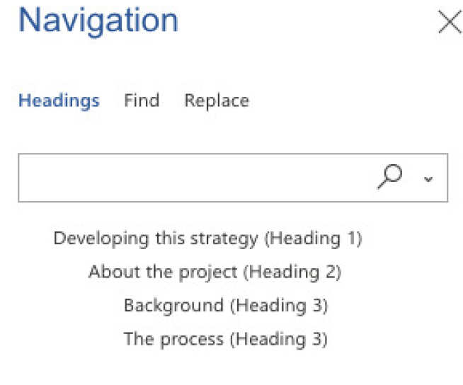
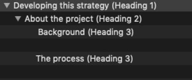
Before you publish or share your document you can check the structure by turning on the Navigation Pane.


Example of good and bad heading structure
The examples below show the same passage of text. One version shows an incorrect use of heading styles and the other has the correct usage. You can also see these in Word by downloading the headings sample document (Word) document.
Example of good and bad heading structure
Why this is bad
- Uses a heading 2 as the main heading
- Although the subheadings looks like heading styles, these are actually just bold paragraph text.
This means there is no obvious structure to this content at all.

Why this is good
- Uses a heading 1 as the main heading
- Uses proper hierarchy - heading 1, heading 2 and heading 3 etc.
This means there is a clear structure and hiearchy to the text.
