The Banner - bottom block is designed as an impact banner that can be used on a standard page and is used to give pages a strong visual impression. It is designed for the top of your page, bottom block just refers to the block under the image, which can have text added to it.
This banner should be used only once on a page.
This content type automatically appears at the top of the page irrespective of its position in the content list.
Instructions
1. Add a Banner - bottom block content type to the relevant page in your site structure. (Find out how to add a content type to a section).
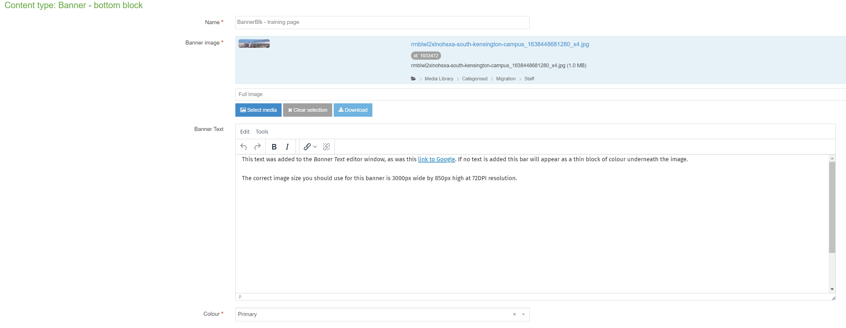
2. Adding this banner is straightforward, once you add your Banner - bottom block, you'll see a short form with four fields:
| Field title | What should I do? | Is it compulsory? |
| Name* | Name the block and give it a concise description e.g. Banner | Yes |
| New Banner image* | Click Select media to choose a image from the Media Library or to upload a new image. An image of 3000 pixels (wide) by 850 pixels (high) is required for this content type. Please view the guidance on adding and selecting images in the Media Library. | Yes |
| Banner text | Text in the grey block below the image. | No |
| Colour* | Changing colour options no longer has any effect, the banner will always display with a light grey text block under the main image. | Yes, defaults to Primary |
NB: Only the name, image and colour are compulsory, if the Banner Text field is left empty the coloured bar will still appear.
Here is an example screenshot of the Banner bottom block content type input window and editor. There is a very limited range of options in the editor for this content type.

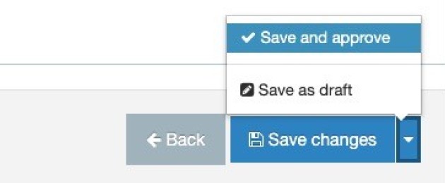
3. Select Save and approve to save your changes.

