The guide has been written for you to use in any way that suits you. There are podcasts and animated videos as well as the text and illustrations.
We talk about data first because data is used to make artificial intelligence (AI). The data chapters lead you into the AI chapters, but you can dive straight into the AI chapters if that suits you best.
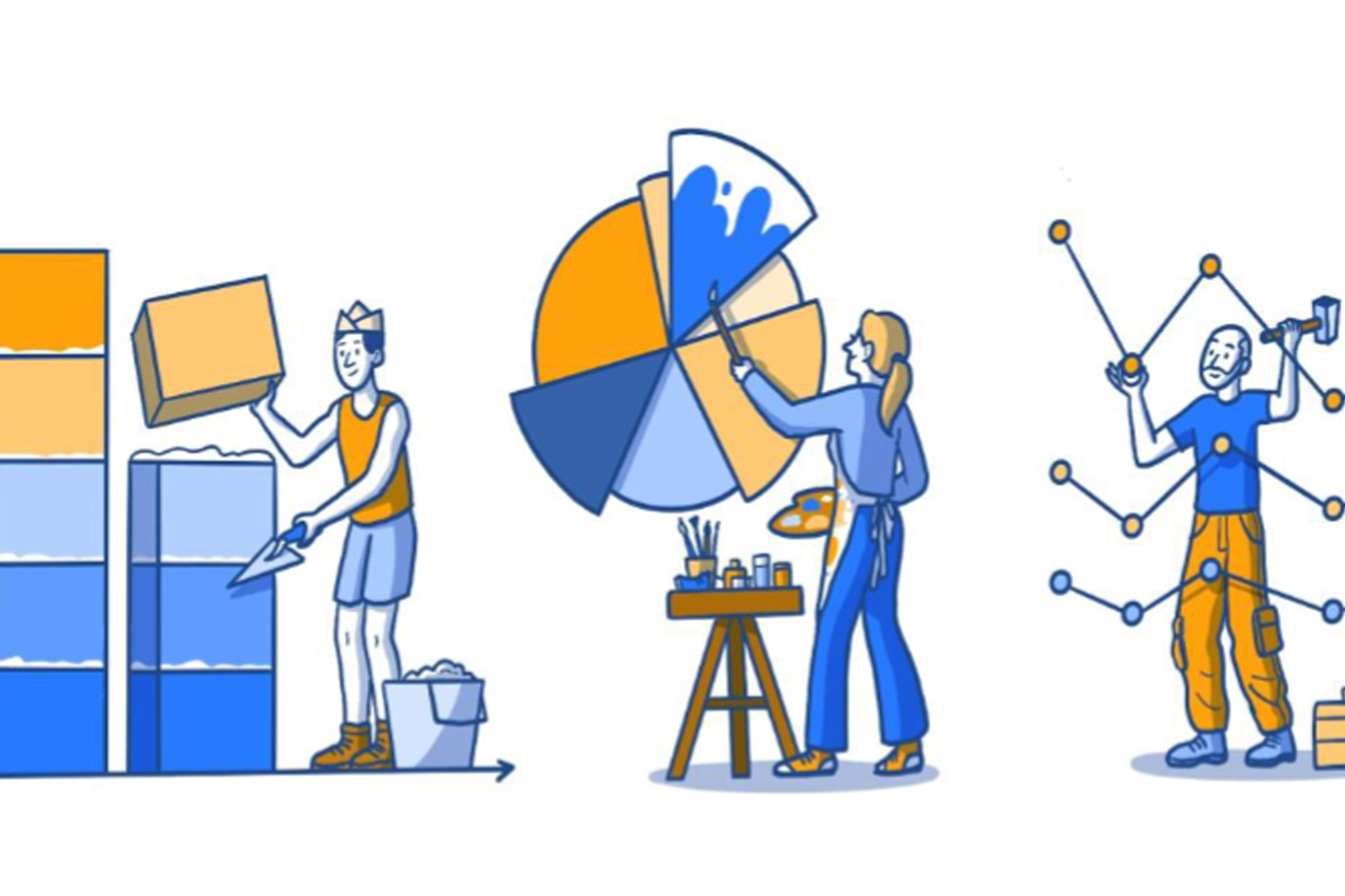
An introduction to data
- What is data?
- How do I know my data is safe?
- Types of data used in research
- Problems with data
- A data project
- Bias
- The problems and benefits of using data in Healthcare
- Correlation and causation
- All data podcasts and animated videos
Data is information. Data can be stored electronically on a computer, a smart phone, written in books, on a bank statement or in a photo.
There are lots of different ways of describing data. We will look at some of the common ways of describing it.
Quantitative data is information that we can measure.
For example, the number of children in a class or the temperature outside. It is data that tells us about a measurement.
Qualitative data is information which describes something.
For example, the colours of football team kits; red, blue, red, and white stripes. The weather is also qualitative data when we talk about the weather in general such as sun, rain, snow or, here in the UK even different types of rain; drizzle, light rain, heavy rain! But not all weather data is qualitative, if we talk about the temperature or air pressure, then that would be quantitative data as it can be exactly measured.
Structured data is data collected in a way that is easy for people to look at or for computers to analyse. If the data is in nice, neat columns or groups it is probably structured data.
Unstructured data is information which is not neatly organised.
An example is written notes in medical records, an email or letter sent between friends. There is a lot of information in these types of records. The problem is that it can be hard for people and for computers to study. We would have changed unstructured data into structured data, but it takes a lot of work and skill. Imagine all the written information in hospital medical records. If we read the records (and even that can be very difficult) we could find pieces of data and write them into an organised table. We would have changed unstructured data into structured data. We would then have structured data which would be easier to use for projects and research. For example, the diagnoses and treatments that are ‘hidden' in the handwritten notes could be found and typed into neat tables so they could be analysed by humans or computers.

Imagine you see your GP because you have a rash on your arm. What would the different types of data be from your visit?
- Quantitative data would be details about you or the rash that could be measured. ‘Size of rash 2 cm x 5 cm , Blood pressure 120/80’.
- Unstructured data would be what the GP typed in your medical records. ‘Saw patient in clinic today. Red itchy rash on arm for 4 weeks, worse on hot days. No insect bites. On examination it is 2 cm x 5 cm on the front of the left elbow. Looks like eczema. Try low dose steroid cream.’
- Structured data would be entered into a database on the GP’s computer.
Diagnosis = Eczema
Location = Left elbow Treatment = Hydrocortisone cream.
So, for all this data what would you tell someone who asked you how you got on at the doctors?
You probably would not think to tell them these bits of data. You would tell them what your experience of visiting the doctors was, what the story of the visit was.
I saw the GP about the rash on my arm. She asked me some questions, looked at the rash and gave me a prescription.
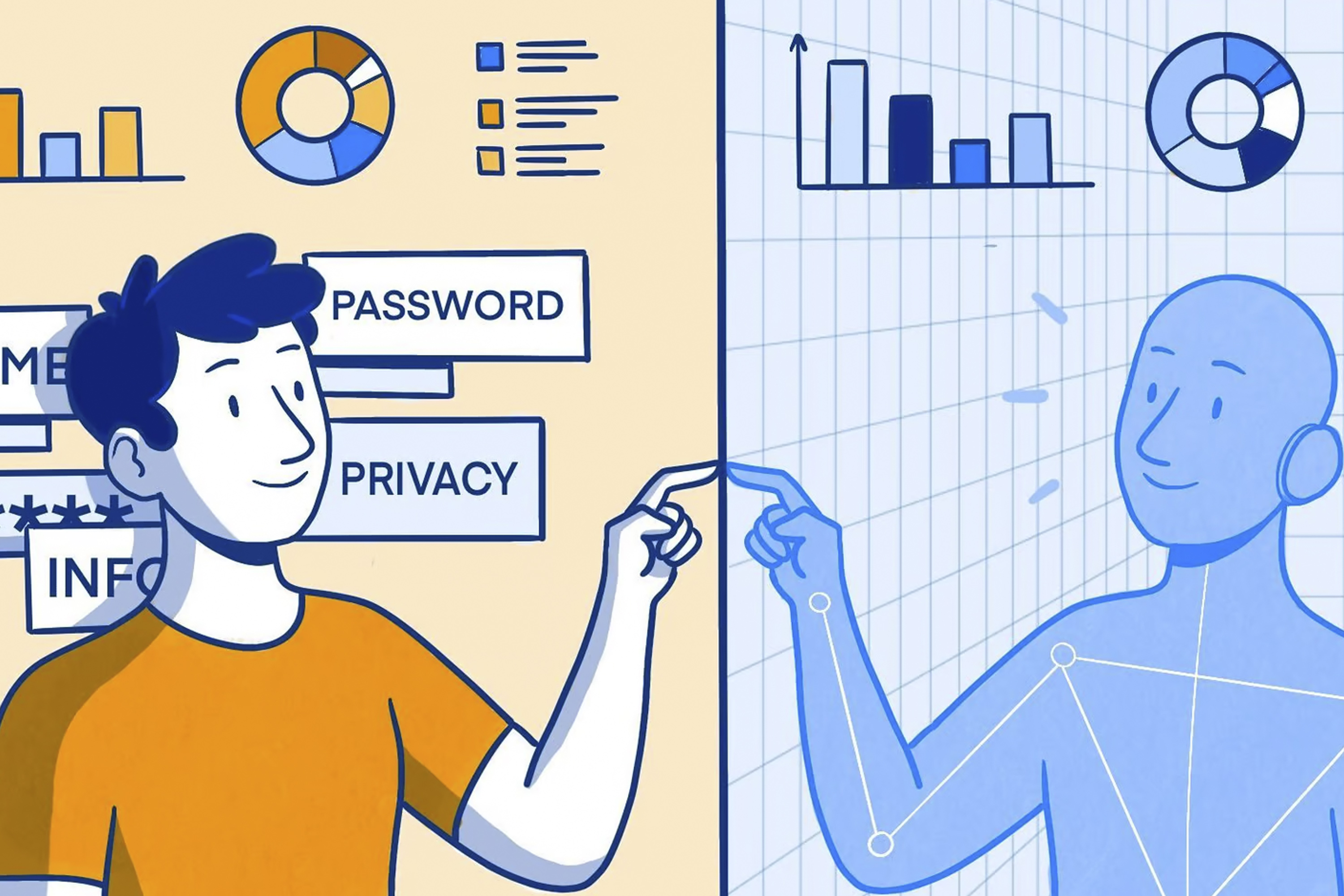
Some people are worried that they can be identified from their healthcare data. They are concerned that private facts about their health could be shared without them knowing. These are really important concerns because we need to understand the benefits and risks of sharing our data.
To help you make choices about who can look at your data, we are going to learn what data can be used to identify someone. We will also learn about some of the different methods that can be used to help protect our healthcare data and our identity.
Data which can be used to identify people
Data which can be said to identify someone is called personally identification information. It is when a few pieces of data are joined up that we start to be able to identify someone. When we think a bout healthcare some people have had illnesses or treatments that they do not want other people to know about. That is why keeping people's healthcare data safe is important.
In healthcare personal identifiable information includes:
- First name and last name
- Date of birth
- Address and postcode
- Gender
- NHS number
- Phone number
- Email address
If someone with enough knowledge (and who was breaking the law) had access to three pieces of this information they could probably identify someone.
We have lots of other personal identifiable information which might not be in our healthcare records but can also be used to identify us. Examples include:
- Bank account details
- Passport number
- National Insurance number
There are also ‘digital’ clues that can be used to identify people. For example the IP address of their device (the address of your computer, tablet or phone on the internet).
The more information we have on a person the easier it is to identify them. That means we must only collect and use the information we really need to do the job or solve the problem we are working on.
How can our data be looked after so that we cannot be identified?
There are different ways to do this. We will describe some of them.
Encryption
This is where data is converted into a secret code so that it cannot be read. This keeps data safe where it is stored, or when it is transferred between people or organisations. It means that no one can use the data if they are not meant to have access to it. If someone illegally intercepts the data or if it is accidentally sent to the wrong place those people will not be able to read the data.
The original data is converted into a code and it is this code that is transferred. When the data is received by someone who has permission to access it they enter a password. The password allows the data to be decoded so it can be used. Encryption is used by lots of companies to protect data. It is used by the NHS to keep data secure when it is on laptop computers for example.
Anonymisation
Anonymised data is where the patient identifiable information has been removed. The data does not include information such as name, date of birth, full postcode, address, email address or phone number. Anonymisation means that the data cannot be traced back to any particular person unless mistakes have been made in the anonymisation process.
Pseudonymisation
Pseudonymised data is data where personal identifiable information has been replaced by a unique code. This has some advantages compared to anonymisation when researchers are working with data but it also has disadvantages. There is still a small risk of being identified from the data. It is very hard to identify a person from pseudonymised data but it is possible if someone has the skills and knowledge and is prepared to break the law.
Differential privacy
Differential privacy is a way of sharing data that protects the identity of the people who gave the data. The actual ‘true’ data is not shared. Parts of the real data are changed into false data. If someone sees the data, they have no way of knowing if they are looking at changed (false) or unchanged (true) data. The changes to the data are done in a way that means the overall patterns in the data stay the same. The data still represents the real world, but the
true data of individual people is protected.
Encryption, anonymisation, pseudonymisation and differential privacy can all protect people's identity when done correctly. But if they are not done properly and mistakes are made it can still be possible to identify people even from anonymised data.
Some questions you might want to ask if you are asked to share your data (Data sharing questions PDF)
- Am I being asked to share my data to support my care or treatment?
- Am I being asked to share my data for research?
- Who is collecting my data?
- How will my data be used?
- Who will be able to access my data?
- Where will my data be stored and how long will my data be kept?
- Is my data going to be used for purposes other than what I am signing up to?
- How personal is the data that I’m giving? Could I be identified from the data or will the
data be anonymised? - What is the benefit to me in giving my data? Are there benefits to anyone else (a
company, the NHS, other people)? - Will this data be freely available to be used by others?
- What will happen to my data once it has been used?
Podcast
This podcast is a conversation between Phil Booth, a data expert, and Jonathan Gregory, a doctor, about sharing your data, how to decide what to share and who to share it with.
We will now learn about data in healthcare research.
Data can be joined up or linked to other data
Linked data involves joining different pieces of data to each other. This is really important when we need to better understand patients, their health and their care needs. Linked data can help us to have a deeper understanding of people’s health.
For example, we find all the medical records of people who have had lung cancer. We then join that to information about where they live. This could be helpful. It may allow us to investigate if where you live has an effect on your chance of getting lung cancer. It may also allow us to understand if the hospitals nearby have enough lung cancer treatment services to look after the patients in that area. We may also want to link data from patient questionnaires to data about their illness or where they received care.

Data available to everyone
Open data is data which is free to use (but there may be limits on what you can use it for). It is usually collected and organised by a research team.
Open data helps people with research. It can make research cheaper and it can help researchers to test ideas 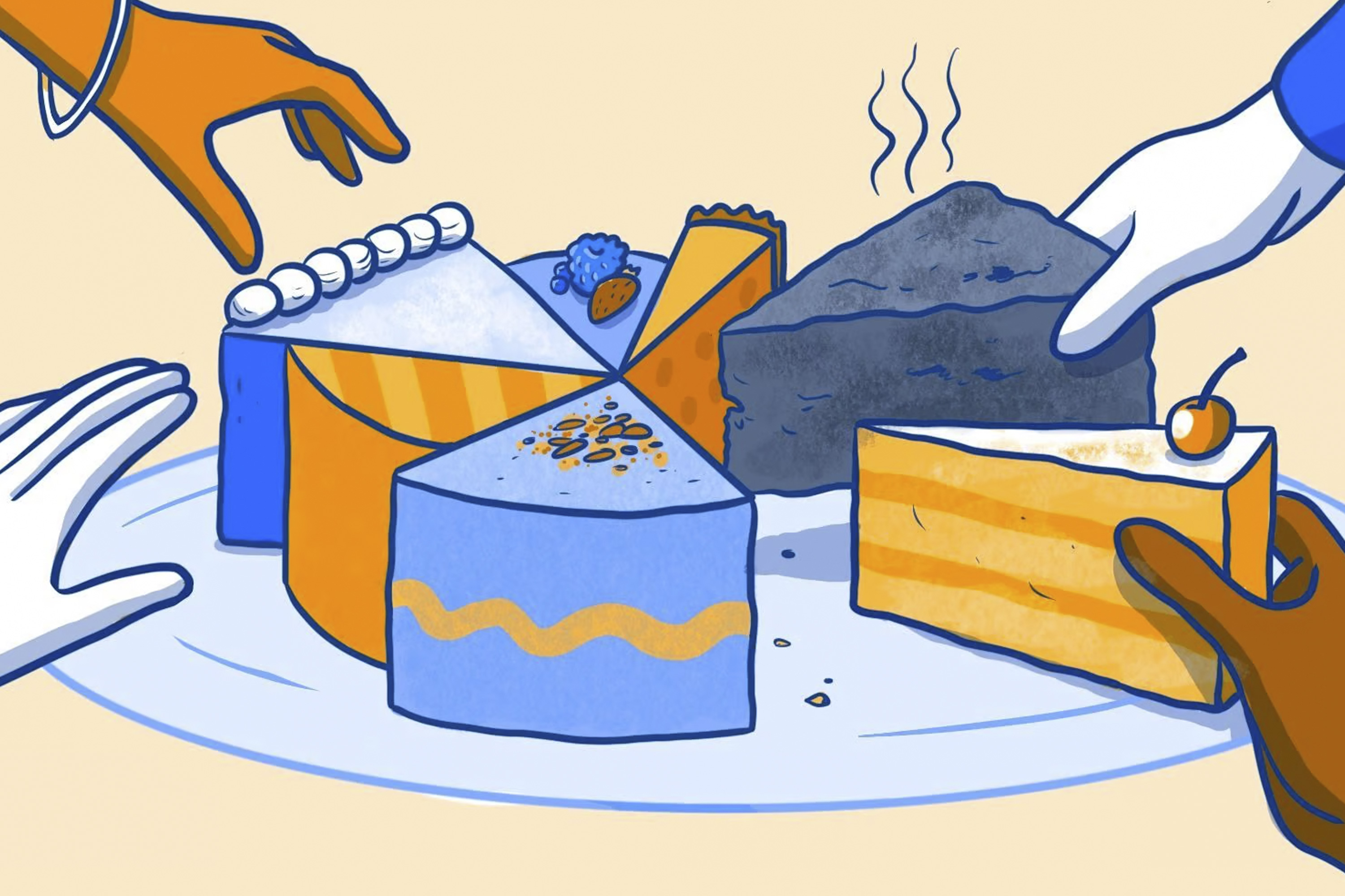 before they start a research project. However, like much of life, just because something is free does not make it good. Not all open data is good quality.
To avoid problems with open data, researchers need to consider where the data came from, if it is accurate and does it relate to the problem they are trying to solve?
For example, there are open data sets of scans where the diagnoses are not accurate because not all of the diagnoses were made by consultants. We might still be able to use that data and learn valuable things from it but we have to be careful.
Secure data environments
Secure data environments are the opposite of open data. The data is held in a secure way with limited access. Usually, the data cannot be moved, it has to stay where it is and be analysed there. Often secure data environments are only worked on by people who have funding from research grants.
Open data and secure data environments have different benefits and problems so we need them both. The most important thing is that we need them to have good quality data.
Synthetic data
Synthetic data is artificial data that has been created to look like the real world. For example, if we had data on 1000 patients who had breast cancer and we understand lots of different facts within that data, we can create a ‘made up ’(synthetic) data set. Overall, this would have the same patterns as the real-life data but none of the ‘made up’ people would have the same data as the ‘real people' who the original data came from.
This can be helpful for sharing data securely, making sure that people’s privacy and confidentiality is protected because the ‘people’ in the data are not real there is no risk of patients being identified. But there is a different risk. If you do not really understand the real-world data, you will create synthetic data which does not represent the real world or the people in it. That means anything you use the data for (for example research or to create a new medical device) will not work in the real world in the way you thought it would.
Many different types of data can be found in our medical records and can be used in medical research if we give permission. In this section, we will learn about some of the problems which can happen when working with data. In particular, we will look at bias in data; what it is and what problems it can cause.
Missing data
It is easiest to think about this with an example.
High blood pressure can cause a lot of health problems in the future if it is not treated. It is important that all patients with high blood pressure have it checked regularly. A recent blood pressure reading can help doctors know how well controlled the blood pressure is and if any changes in treatment are needed.
Imagine there are two GP Practices, Practice A and practice B. Both have 100 patients who have high blood pressure. We ask the Practices to tell us about their patients who have a diagnosis of high blood pressure recorded in their medical records and when they last had their blood pressure checked.
GP Practice A sends us data for 100 patients who have a diagnosis of high blood pressure recorded in their medical records. 90 of these patients had a recent blood pressure reading but 10 patients did not.
GP Practice A has "missing data” for the 10 patients who have not had a recent blood pressure check.
GP practice B sends us data for 80 patients who have a diagnosis of high blood pressure recorded in their medical records. All of them have a recent blood pressure reading recorded in their medical records.
At first it seems like GP Practice B are better at checking the blood pressure for their patients because all the patients have a blood pressure check recorded.
But GP Practice B has a different problem. Twenty patients have high blood pressure, but the diagnosis has not been saved in the medical records. This is also "missing data."
In the real-world GP practices are very good at recording patient diagnoses and checking blood pressure results for people with high blood pressure.
But hopefully this example shows you that it can be hard to compare data from different places and you have to be careful as missing data can be hard to spot – because it’s missing!
Mistakes with data
There are lots of ways mistakes can be made when recording data.
For example, if we are not careful with units. Units are a standard way to measure things like height, weight, temperature. Imagine you are asked to write down your height. It asks for this in centimetres, but you write it in metres. You thought you were writing 1.6 metres; you record 1.6 cm because you didn’t read the units carefully. Usually this is easy to spot as no one is 1.6 cm tall.
But it is not so easy to spot if a result is wrong for that person but could be right for someone else. You are 160 cm tall but you make a mistake, your finger slips on the keyboard, and you type 180 cm tall. It is possible that someone is 180 cm tall so it would be extremely hard to spot this mistake, but it could cause real problems for example when looking at blood results or working out the dose of a treatment according to height and weight.
Inconsistent Data
This would be where we asked for height in centimetres, but some people write it in feet and inches.
When data has been recorded inconsistently, it means a lot of time has to be spent correcting or cleaning the data before it can be used. It could also be where doctors have written different words to mean the same thing, for example, MRI scan, MR scan, MR all mean the same thing to doctors but can cause problems when analysing data.
Example: Dohh With Data
Researchers were investigating patients with diabetes. They collected data from lots of GP practices.
They noticed something odd about one of the cases. There was a patient that had been recorded as being dead but there were test results in the notes after the date of death.
The researchers investigated this.
In the GP database there was a section to write the date of death. This had been filled in with a date. Next to this was a box where text could be typed and in that box it had been entered 'of dog'.
The patient hadn’t died at all! Someone had recorded the death of the patient’s dog in the database (probably because the patient had discussed being upset after their dog died).
The person filling in the records had tried to be helpful but had made the data inaccurate.
There is so much data about our lives that is easy for some of it to be recorded incorrectly, not be recorded at all or put in the wrong places on forms and in databases.
We have learnt about some of the problems that can happen with data and how those problems can lead to patients being put at risk and even harmed. In this chapter we are going to learn how the data is used in projects and research. We will see the steps in a project and how we need to be careful when interpreting results.
In a factory we have quality control so that faulty items are rejected before they are packaged up and sold. We have to do the same with data. We have to check it and ensure the quality of the data is good enough before anyone uses it.
In data science projects we combine problem solving, computing and mathematics in ways to help us understand data. The aim is that by investigating the data we can find and understand patterns in the data which we can use to help us solve problems. There are several stages in a data project and these show us how data is used in real life to solve problems in healthcare and other areas of the world around us.
A data project usually has seven stages:
1. Problem analysis
The first stage is to understand the problem we have to solve. The data scientist works with others so they can understand what data might be needed to solve the problem. Once the exact problem is understood then the team can decide what data they need to collect and how they might collect it.
2. Data collection
The second stage is where the data is collected. It might be structured nice tidy data or it could involve something called ‘scraping ’where data is taken from places where it is not stored in neat tables, for example, webpages. Finding the right data may take a lot of time and effort.
3. Data preparation
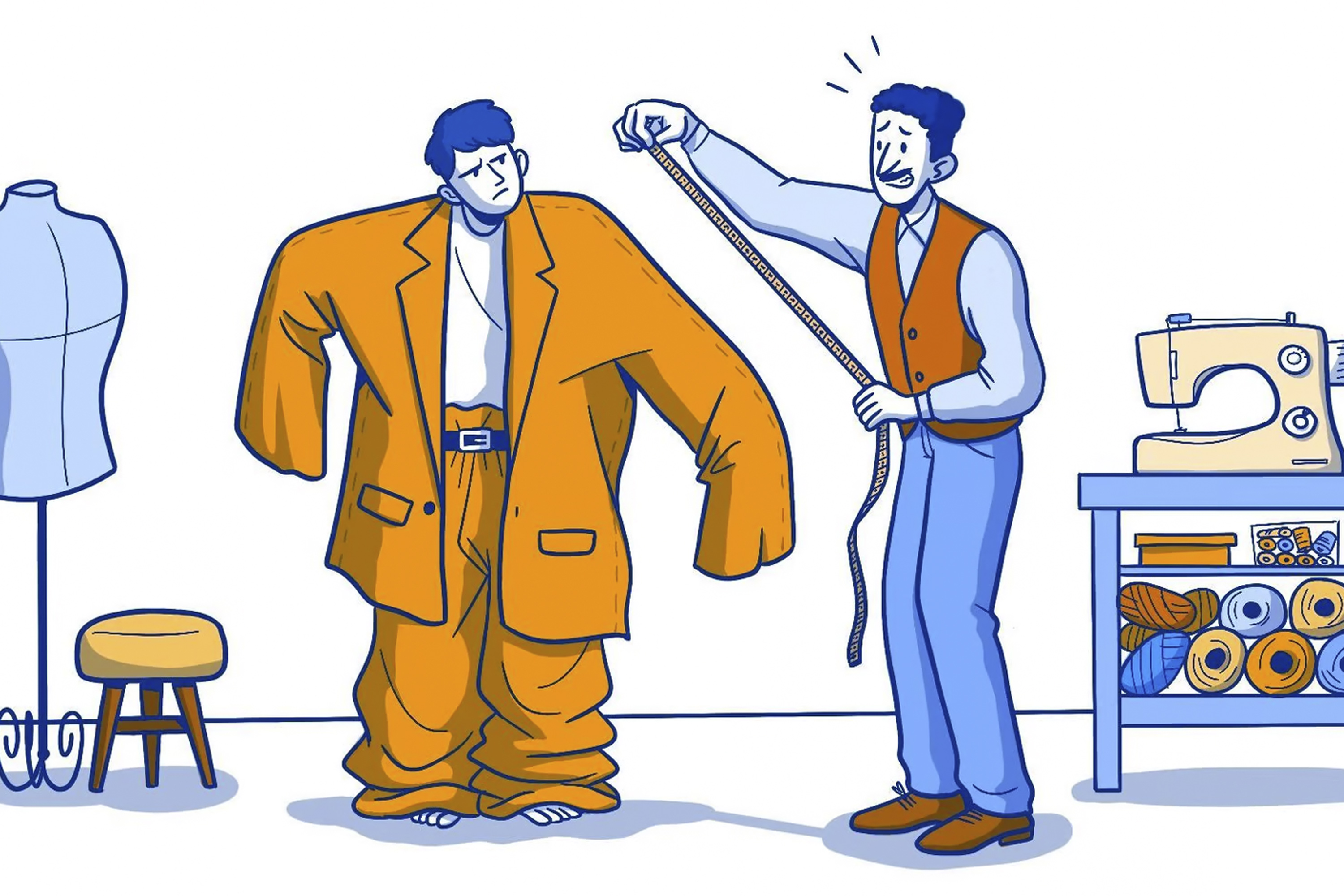
This stage involves two jobs. Data cleaning is the most time-consuming process as it involves ‘cleaning’ the data of all the errors we met in the section, Mistakes with data, for example missing and duplicate values. We also need to check if there could be bias in the data. Then a process called data transformation is used to change the data so that it is set out in the best way for analysis. It’s like you getting dressed smartly for an interview or wedding, you are the same but you appear different. It’s the same with transforming data: it’s the same data but its appearance has been changed to make it more appropriate for the situation.
Even when data has been collected very carefully it will still need to be checked and tidied up before it can be used. Before it has been cleaned the data is called ‘raw data’ and it is exactly how the team will have collected it - mistakes and all. It is important that during the cleaning process we don’t make changes that affect how ‘truthful’ the data is.
There are lots of different checks and tests done on the data at this stage. We would ask questions like these to help us check the data.
- Are there missing values?
- Are there duplicates where a person appears more than once in our data?
- Are the results all using the same measurements for example not a mixture of height in metres and feet.
- Then we need to ask ourselves, does the data seem sensible? Does it look like what we would expect? Could the data be biased?
- If the data has been collected over a period of time, was the way it was collected the same or did it change at some point? For example, if we were measuring temperature did we change the thermometer we used? If we had data on blood tests did the laboratory change the way it checked the blood during the time we have collected data?
An example of data checking
We have collected data on the weight of children in a school. We are worried that some are overweight, and some are underweight. We have results on 100 children.
- Are there missing values?
No, the school says there s 100 children and we have 100 results. - Are there duplicates where a child appears more than once in our data?
Yes, one child has had their result collected twice and now we find out one child was off school that day. So, after cleaning this we have 99 results for 99 children and one child was off. - Are the results all using the same measurements?
No. Most weights were in Kilograms, but some were in stones, so we change those to Kilogram in the data. - Are any outliers?
Yes, one child has a weight of 350 Kg. Another has a weight of 60 kg. We check and the 350 Kg should be 35 Kg, a zero had been added by mistake. We check the 60 Kg as this is heavier than the other children of the same age.
The result is correct. The child is very tall and muscular. - Does the data seem sensible? Does it look like we would expect?
Yes. The range of weights we have collected, and the averages look like the children in the school. When we compare our data to data from other studies it is very similar.
Good news. We did a good project. Our data was good after we had cleaned it and even better the children in the school are all the right weight!
4. Exploratory data analysis
This is where we explore the data using mathematical tests to look for relationships. Is one thing related to another? Could one thing be causing another? This is a vital stage because choosing the wrong parts of the data to use will produce an inaccurate result.
The simplest tests look at the lowest and highest values and averages. More complicated tests look to see if different pieces of data are related and how they are related.
When we are exploring data, often patterns come to light. These patterns can look convincing, and we can think that one thing causes another. But there is a difference between two pieces of data being linked (correlated) and one thing changing another (causation).
This is one of the most important things in this chapter. Lots of people get this wrong – especially newspapers and that’s why we get some attention grabbing headlines that don’t actually fit the facts!
The data scientist will run different mathematical tests on the data to find out which help them to best understand and explain the data. They will also see if there are tests that can use the data to make predictions. Can we find a rule from the data we could use in any situation that would give us helpful answers? For example, to make a prediction about a patient’s risk of a heart attack from data on their blood test results?
5. Data modelling
The data scientist will run different mathematical tests on the data to find out which help them to best understand and explain the data. They will also see if there are tests that can use the data to make predictions. Can we find a rule from the data we could use in any situation that would give us helpful answers? For example, to make a prediction about a patient’s risk of a heart attack from data on their blood test results?
The aim of stage five is to solve the problem we identified in stage one.
6. Visualisation and communication
We now use tools which help us to see the patterns in the data. We use graphs and diagrams to show the data in different ways. The phrase ‘A picture tells a thousand words’ is true when we are studying data. The words we use when we talk about data can affect what people think. Part of presenting data is being aware that the words we use and the graphs we draw affect how people interpret the data. It is easy to accidentally (or deliberately) mislead people when showing them data and the results of research.
The words we use when we talk about data can affect what people think
How we present data to readers or our audience can have a big effect on what they think. For example, we could talk about the death rate (mortality rate) from children’s heart surgery being 5%. Or we can talk about the survival rate of children’s heart surgery being 95%. Describing a 95% survival rate sounds a lot better than talking about a 5% death rate. This is called framing, and it can have a big impact on how we interpret data. Often the media use framing to grab your attention with headlines.
A good example of how framing can be used was in a campaign to reassure people that London was safe. The campaign proudly said that 99% of young people in London do not commit serious violent offences. Positive framing. If we wanted to paint a more worrying picture, we could frame this negatively, ‘1% of young people in London DO commit serious violence’.
If we wanted to worry people even more, we could use the power of big numbers. Most people don’t find it very easy to imagine percentages especially when the percentage relates to a really big number. If we convert the percentage into a number, it might grab people’s attention.
There are approximately one million people in London aged 15-25. That means one per cent is 10,000 young people. Now if we really want to worry people we can say ‘There are 10,000 young people in London who commit serious violence’. This feels a long way from where we started doesn’t it? But it is the same as 99% of young people in London do not commit serious violent offences. Both are correct but the framing affects how we feel about the numbers.
7. Deployment and maintenance
This is the final stage. The model is tested again and then put into the real world. The model will be used to make reports and data dashboards are used to check data in real-time. The model's performance is checked and supported. This then marks the end of the data science project.
An example of a project like this would be delivery companies using data to discover the best route to take to make deliveries to speed up the process and reduce costs. Airline companies have used data science projects to help them predict flight delays and notify the passengers beforehand and plan how to catch up the delay as quickly as possible.
Bias
Let’s start by watching this two-minute video introducing you to bias in data.
What is bias?
Even when we have data that has accurate results and is well organised we can still have problems with it.
Being ‘biased ’is where you favour one person or group over another.
Unfortunately, because data is affected by the world we live in, it can be biased.
It can be biased by how it was collected or how it was used. There may be people missing from the data or too many of one group of people compared to another. Both of these mean that the data does not reflect how the world really is. We have to check that the data is representing everyone that needs to be included.
We need to be aware of bias in the data and the bias of the people looking at the data.
Why does bias matter?
Bias matters because it means that the data is not giving us a true picture of the world. The data is not giving us the whole story, only part of the story. If we use the data to make decisions thinking it will be good for everyone, we might find we actually cause problems for some people. We need to check if the way we collected the data or the way we have used the data has created bias. We have to be on the lookout for bias at all times. It can be hard
to spot.
Here are some questions we might ask ourselves to try and make sure we have not accidentally created biased data:
- Does the data represent everyone who will be affected by the results of the data analysis?
- Have we excluded groups from the data who need to be in the data?
- Have we included everyone who needs to be in the data?
- Did we get a response rate that was appropriate across different communities?
- Could everyone understand what we were asking?
- Could everyone take part (language, time)?
- Did we ask the right questions to get accurate data?
- Have we been open-minded? Have we allowed our pre-conceived ideas or thoughts to affect how the data was collected?
- Have we tested the data to see if using it could result in any unintended problems? Do the results work equally well for all groups of people?
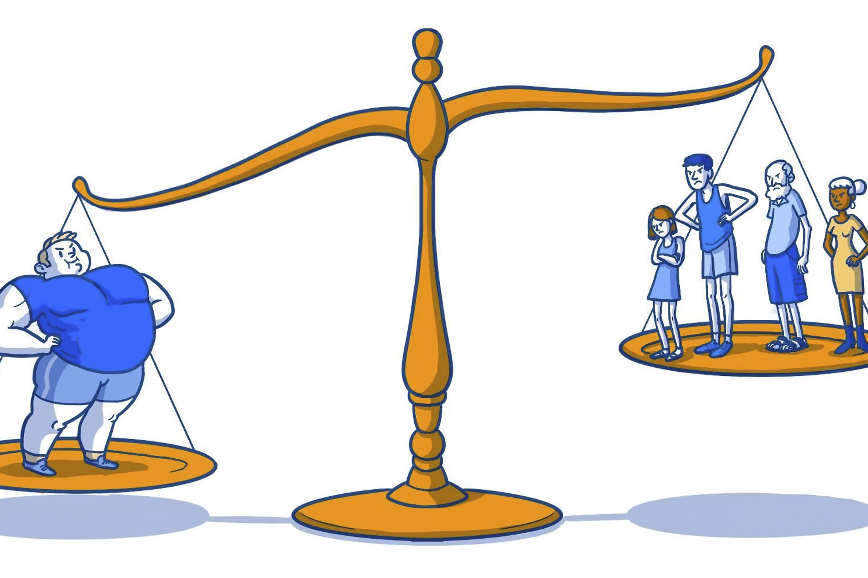
Types of Bias
There are many types of bias. People who work with data need to know these so that they can be on the lookout for them. Here we talk about just a few of the types so you can see how easy it can be for bias to ‘creep’ into data.
 Selection Bias
This is where data does not contain a balanced range of people.
An example would be when we collect feedback on a hospital.
Are the people who give feedback representative of all the people who use the service?
We need to check that feedback comes from all groups of people. There is a risk that only people who liked the hospital or who were angry with the hospital give us feedback. That means we are not getting the opinions of people who didn’t think it was very good or very bad but that might be the biggest group of people.
 Confirmation Bias
This is when the person looking at the data allows their own thoughts (bias) to affect how they study the data and confirm what they were already thinking.
They are not studying the data with a completely open mind, and often accidentally, notice patterns in the data that agree with what they think and don’t notice patterns in the data that mean their ideas might be wrong.
 Outlier Bias
This is where a small part of the data has a big effect on the data overall.
Imagine you live in small block of flats. There are nine flats. On the ground floor and first floor there are four flats on each floor. An estate agent thinks they are worth about £100,000 each. There is one flat on the top floor. It is as big as four flats combined. It’s a penthouse with amazing views of the city. he estate agent thinks this is worth £1,000,000, £1 million pounds.
Your flat is worth £100,000. You try and get some insurance for your house, and they say the average cost of flats in you block is £200,000.
Why would they think that? No flats in your block are worth £200,000! The million-pound flat is an outlier, and it is affecting the average. The average doesn’t give us a good idea of the real world because the outlier is having a big effect on the data.
 Survivor Bias
A famous example of survivors bias comes from the second world war.
The American air force wanted to improve the protection on their planes so that they were less likely to crash if they were shot. To do this they studied the planes that made it back to base to see where they had been hit. But that meant they were only looking at the planes that had made it safely back home! It was the planes that had crashed that they needed to study!
They were studying the ‘survivor’ planes and not the planes that had crashed, which meant that the data would not give them the answer they needed, it would be biased.
We have to be very careful of survivor bias in healthcare. When we look at long term data for patients this will only tell us about ‘survivors’. This might not help us understand the disease in patients who have died. This can affect our results and mean that we are not learning how to make more people survive their illness.
Real World Example: Bias in measuring oxygen levels in blood
Pulse oximetry is a way of measuring the amount of oxygen the blood in your arteries is carrying.
A clip is put over the fingertip which is connected to a machine (an oximeter). The clip uses visible and infrared light to measure the level of oxygen in the arterial blood. Often the pulse oximeter is clipped to one hand whilst a nurse or doctor checks your blood pressure on the other arm.
Oximeters were developed in the 1940’s. They were first used to measure oxygen levels in airplane pilots flying at altitude. Improvements were made to the machines in the 1970’s so that they could be used in hospitals. To test the machines, readings from the pulse oximeter were compared to test results from blood samples which give very accurate measurement of oxygen levels.
These studies showed that the machines were less accurate when people had low levels of oxygen in the blood. Some studies also showed how pigmented someone's skin could affect the accuracy of the machines.
When the machines were used on people with darker skin, they could give a falsely higher reading than the actual level of oxygen in the blood.
Both of these problems were well recognised by doctors and researchers who were experienced in using the machines. But, as the machines became more common and were used by less experienced people these problems were gradually forgotten.
Over the last 20 to 30 years pulse oximeters have been regulated as medical devices. There are legal standards they have to meet before they can be used in hospitals. But, because pulse oximeters were invented before these rules were introduced there has been a problem. When you have a brand new technology you have to meet all of the new rules with new evidence. But if you are using technology that was invented before the rules were introduced you need to show less evidence.
In this case, because oximeters had existed for many years companies did not have to demonstrate lots of new evidence. Just showing they were 'as good as' old machines was enough. Some companies did test their machines from scratch. They checked how accurate they were in different skin tones and gradually improved how accurate the machines were.
However, some companies did not perform a lot of retesting. They relied on showing evidence that their machines were as good as older machines. But, only being as good as these older machines meant their machines were less accurate in some patients, particularly those with darker skin or low oxygen levels.
These machines are so common in hospitals that the staff using them assumed they all worked the same and treated the results the same. People forgot to make an allowance for darker skin or when people had low blood oxygen levels. Oximeters have been designed which are accurate no matter what skin tone is. But these machines are often much more expensive. Also, these machines were not designed for patients to use in their own homes.
A group of doctors in the USA studied pulse oximetry in a large number of patients. They 'rediscovered' what had been largely forgotten. They made their rediscovery because of a large amount of high-quality data. They collected 48,097 results from 10,001 patients using one type of pulse oximeter.
When they analysed this big sample, they were able to see a problem. They found that this type of pulse oximeter machine did not work as well in Black patients compared to White patients. The machines also were not as good at detecting low oxygen levels, with the machine recording a higher result than the actual oxygen level.
Black patients were three times more likely to have a low oxygen level missed by the technology compared to white patients. This meant that the results could mislead doctors into thinking some Black patients were not as ill as they actually were. That will have meant some patients did not get as much treatment as they needed.
The problems with pulse oximetry teach us that we have to be much more careful to test devices with people that are the same as the people who will be treated with the device in the real world.
It also shows us that good quality data needs to be collected so that we can identify problems as early as possible. It shows us that good data can help improve healthcare.
The problems and benefits of using data in Healthcare
So far we have thought about what data is and the problems we can have when using it. We have learnt about the importance of high-quality data and how we need to be careful with bias, correlation and causation. In this chapter we will look in more depth at three examples of data being used in healthcare and healthcare research to bring together all that we have learnt so far. These examples will hopefully show you some of the problems we have been
talking about.
Working with healthcare data can be powerful so we all need to understand how it can affect us for good and for bad. In his book, The Art of Statistics Learning from Data, Professor Sir David Spiegelhalter shares many examples of data being used well and not so well. Here we describe two of his examples.
Problems with data in healthcare
Results can be misleading.
Real World Example: Eating meat gives you cancer
In 2015 newspapers reported that processed meat, such as bacon, ham and sausages increased your risk of bowel cancer. The way this story was presented gives us a powerful learning point.
The papers reported that experts had found that eating 50g of processed meat a day increased the risk of bowel cancer by 18%! At first this sounds like eating processed meat might be really dangerous for you.
“One of the biggest problems in looking at data is where people mix up absolute risk and relative risk.”
But, digging into the data shows us that this number is right but it doesn’t mean what we think it means. The headline makers tripped over the difference between absolute risk and relative risk. Newspapers struggle with this (or choose not to understand it) and it leads to a lot of misleading headlines.
Relative risk is where we compare one group of people to another. It is one group ‘relative ’ to another. In this study they compared a group of people who ate 50g of processed meat per day to a group of people who didn’t. They found that the group who ate 50g of processed meat had an 18% increase in bowel cancer compared to the other group. So far so good, it looks like the headline in the paper was correct.
But– before clearing all the meat products out of your fridge there is a vital question that you need to ask yourself. What was the risk of bowel cancer for the group people who didn’t eat processed meat? What is the baseline risk that we all have whether we eat meat or not? This is the ‘absolute ’risk.
The absolute risk of developing bowel cancer (for an average person) is 6%. That means if we have 100 ‘average ’people six will get bowel cancer in their lifetime, even if they do not eat processed meat.
Now we can return to our relative risk. Eating processed meat increases the baseline, the absolute risk by 18%. Increasing the absolute risk of 6 people in 100 by 18% means that 7 in 100 people will get bowel cancer in their lifetime. The 18% increase in bowel cancer is one extra person out of 100 people who ate processed meat every day.
This is still important, and people might choose to change their diet to reduce their cancer risk. It is important if we think about the numbers of people with bowel cancer in the whole country. One extra person in 100 when we think about the many millions of people in a country will mean there are a lot more cases of bowel cancer. But for one individual person making decision about their lifestyle this difference of 1 in 100 feels different to an 18% increase.
These examples show us that reporting the results of studies requires care and attention to avoid misleading people. We all need to understand a little bit about data so we can decide if we believe what we are being told.
Real World Example: The benefits of using data comparing hospitals
In 1996 the General Medical Council investigated children’s heart surgery at Bristol Royal Infirmary. There were concerns that the service was not as good as other hospitals. There were concerns that more children died after being treated there than at other hospitals.
Professor Sir David Spiegelhalter led a team of investigators to compare the survival rates for children who had surgery in Bristol with survival rates in other hospitals in the United Kingdom.
At first you may think this should be an easy investigation but when you are using healthcare data you have to be careful as not everything is as it first seems.
First, they had to decide what types of heart surgery they were going to focus on and how many children had received those operations. Not all operations have the same difficulty so they needed to make sure they focused on the sorts of operations most likely to be linked to problems. They also had to decide ‘when ’a child who died following surgery had died because of the operation. Whilst we would all agree that a child who died during the
operation or a few days later died ‘because of the operation ’what do we think about a child that died two months later? What happens if they went home but then came back into hospital and died – was that death still due to the operation?
Once they had decided the answers to those questions they had to start looking at the data. There were different sources of data. There were ‘hospital episode statistics’, which are created by hospitals to record the work they have done but this data often contains mistakes. There was also data from national death records, and a cardiac surgical register where surgeons recorded operations they had done. When comparing all these types and sources
of data, the number of operations and the number of deaths recorded were different. It took a lot of work to clean and tidy the data so that it could be used in the investigation.
The investigation predicted that, if Bristol were like other hospitals, there would have been around 32 deaths in Bristol. This number of deaths would have been expected when you consider how ill the children were and that even with good care you cannot save every child. But there had been 62 deaths over this time. 30 more than we would have expected.
The next question was were any of these extra 30 deaths avoidable? Was it that Bristol had been seeing really ill children and in fact more of them would be expected to die? These would be unavoidable deaths. Or was it that there were children who should have survived who in fact died because of the care at the hospital? These would have been avoidable deaths.
Some hospitals will have more or less deaths than the ‘average ’due to random differences in the patients who go there. For example, in one year there may be many more seriously ill patients having surgery in a particular hospital. This would make the death rate go up. There would be excess deaths compared to the average, but those deaths might not have been avoidable.
It is possible for the death rate to be higher or lower than expected when in fact the hospital is doing the same as always. But, in the case of the children’s heart surgery service in Bristol the difference between the expected and observed number of deaths was large. It was so large that it told the investigators that there was a genuine problem with the service and not a problem with the data. The results of children’s heart surgery in Bristol were worse than other hospitals. The service was reorganised and restaffed.
What appeared an easy question – did more children die after heart surgery in Bristol than would be expected? - was in fact much harder to answer and that can often be the case with data.
Hopefully you can now see how powerful data is when used in healthcare. It can do lots of good but also cause harm unless we are careful. Perhaps one of the biggest uses of data today is to create artificial intelligence (AI). Let's move on to the next section so we learnt what AI is and how it is related to what we’ve learnt about data.
Correlation and causation
When we are exploring data, often patterns will be noticed and researchers have to work out if one thing is causing another or if they are just following the same pattern.
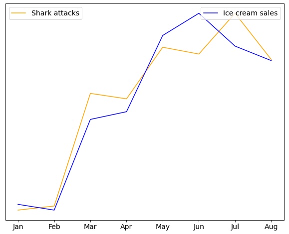
Imagine this headline - Ice Cream causes people to be attacked by sharks!
If we look at data on ice cream sales and the numbers shark attacks in the United States each year, we will find that the patterns in the data look the same. They are correlated. But that is different from one causing the other. Could eating an ice cream increase the chances of you being attacked by a shark? Could being attacked by a shark make you more likely to eat ice cream?
The more likely explanation is that more people eat ice cream and get in the ocean when it’s warmer outside. More people in the ocean means more shark attacks. Temperature is what links ice cream sales and shark attacks. They are not directly linked to each other. Although ice cream sales and shark attacks are highly correlated, one does not cause the other.
Video
This is an animated video on causation and correlation.
Podcast
This podcast is a conversation between Phil Booth, a data expert, and Jonathan Gregory, a doctor, about sharing your data, how to decide what to share and who to share it with.
This is an animated video on causation and correlation.
Let’s start by watching this two-minute video introducing you to bias in data.
Contact us
For general enquiries email: imperial.dcs@nhs.net
For data access enquiries email: imperial.dataaccessrequest@nhs.net
iCARE social media
X: imperial_iCARE (link)