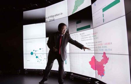
The rise of Big Data has provided researchers and industry with new opportunities to discover insight. One key tool for exploring and communicating data is data visualisation. While with the rise of tools such as Hadoop and Spark has enabled data processing to scaled to support the big data revolution data visualisation has not undergone a similar revolution. Visualisation is a critical part of the data science for two reasons. Firstly, the human visual system excels at pattern recognition and we are best able to make sense of big data sources through the visualisation of data and subsequent analytics. Secondly, once insight has been gained from data visualisation, visual representations of data as well as analysis results are typically the most effective means of communicating results.

To enable visualisation to scale we designed and built the Data Observatory, an immersive data visualisation environment. The facility provides a social interdisciplinary environment which:
1) Enables researchers to make sense of Big Data
2) Supports quantitative decision making
3) Allows research into how decisions are made
Within the Visualisation theme we conduct three types of research:
1) Tools and techniques to support the scalability of data visualisation to Big Data
2) Explorative data-dense visualisation for exploring Big Data
3) Presentation of research results
We are very keen to collaborate with researchers and industry on all areas of our research and are always excited by data science problems where visualisation could help. Please do get in touch with the Visualisation team (ove@imperial.ac.uk) to explore opportunities.


